
Now, it became a one column layout again. I should have written my own style.css including media queries, for example:
@media screen and (min-width: 1000px) {
    .has-sidebar:not(.error404) #primary {
        float: right;
        width: 58%;
    }

    .has-sidebar #secondary {
        float: left;
        padding-top: 0;
        width: 36%;
    }
}
With the above code, the sidebar should appear on the left side only if the screen width is more that 1000px.
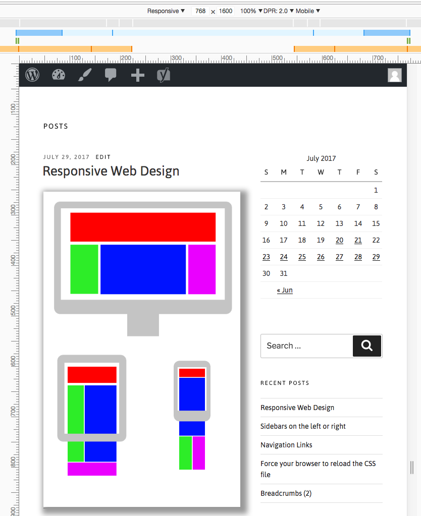
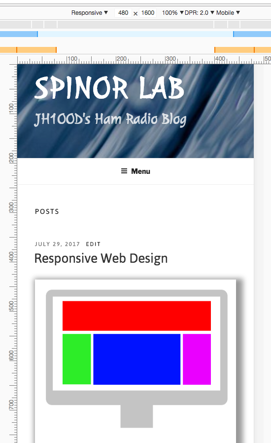
This is when the width is 768px.
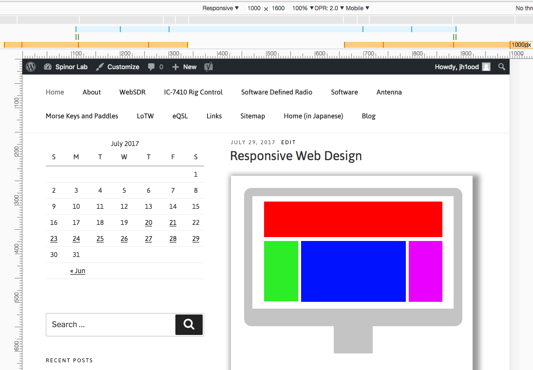
And this, with 1000px.