Click the above link to see all the graphs and the source code.

Ham Radio Blog
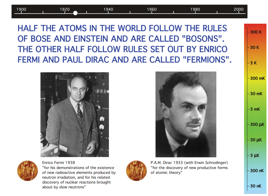
I did not know that the word “fermion” is coined by Dirac.

In his very famous book, “The Principles of Quantum Mechanics”, he says, in the page 210 (fourth edition), that:
The electron is a fermion with spin 1/2, and without electrons there is no joy of ham radio, you know.
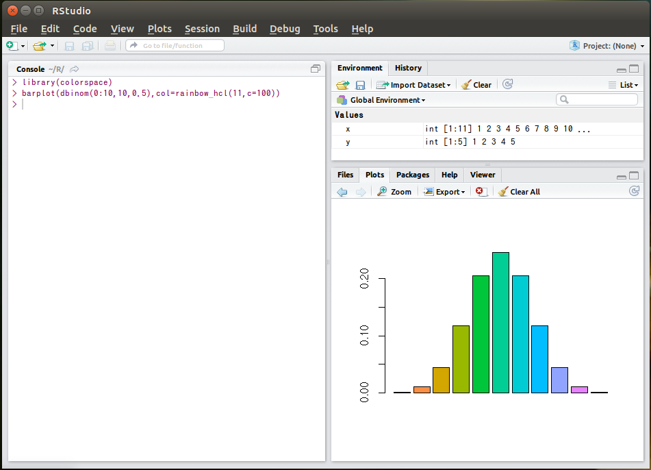
RStudio is an integrated development environment for R.
It took me several hours to get it working with various minor problems such as:
X11 font -adobe-helvetica-%s-%s-*-*-%d-*-*-*-*-*-*-*, face 1 at size 16 could not be loaded
RMeCab is an interface from R to MeCab.
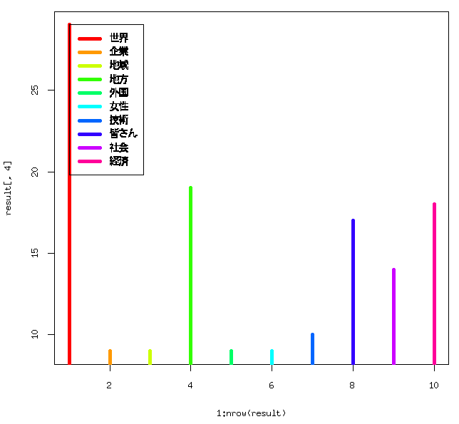
% R
> result <- RMeCabFreq("Abe.txt")
The above code gives you a word count table from the text file “Abe.txt”, Policy Speech by Prime Minister Shinzo Abe to the 186th Session of the Diet, Friday, January 24, 2014.
From the table, you can draw graphs such as the most used nouns in the text. The most used noun was “world” shown as red in the graph, which appears 29 times in the speech. Other words in descending order is: “local regions (in green)”, “economy (in pink)”, “my fellow Japanese (in blue)”, and so on.
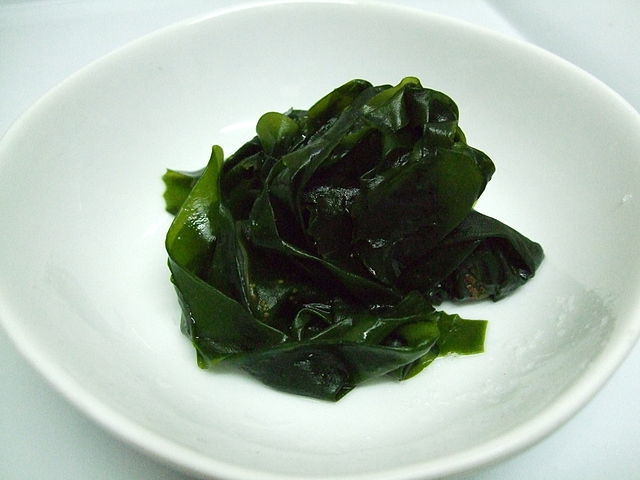
MeCab is some lower part of “wakame”, edible seaweed, but is also a “Yet Another Part-of-Speech and Morphological Analyzer” for Japanese text segmentation.
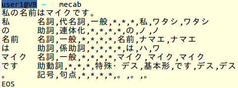
Let’s see what happens when you put a Japanese sentence, “My name is Mike.”, into MeCab.
 <Figure 1. First Dash
The numbers 0, 1, 2 and 3 at the right indicate the order of the dot or dash in a single character. Can we say that the first dashes are somewhat longer than the others?
[1] http://homepage2.nifty.com/jo1fyc/sound/20010915amenimomakezu.mp3
This is a histogram of Morse code by JO1FYC.
[1] http://homepage2.nifty.com/jo1fyc/sound/20051010_nikki-32.mp3
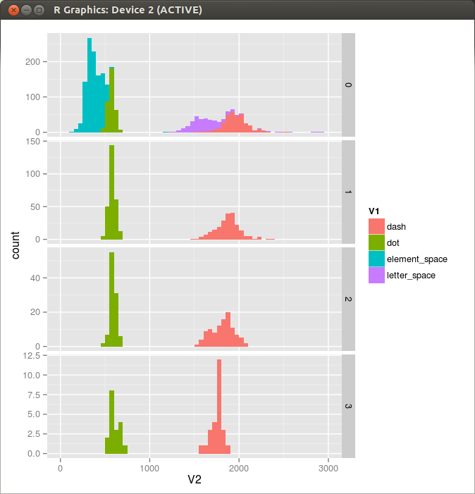
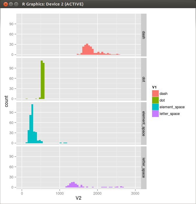 Figure 1. Histogram
ggplot(mydata, aes(x=V2, fill=V1)) + geom_histogram(binwidth=50)+facet_grid(V1 ~ .)+xlim(0,3000)
One more from JO1FYC.
[2] http://homepage2.nifty.com/jo1fyc/sound/20010915amenimomakezu.mp3
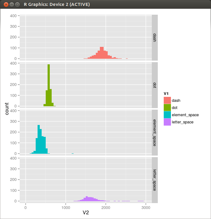 Figure 2. Histgram 2
Still more from JO1FYC.
[3] http://homepage2.nifty.com/jo1fyc/sound/20010504nikki.MP3
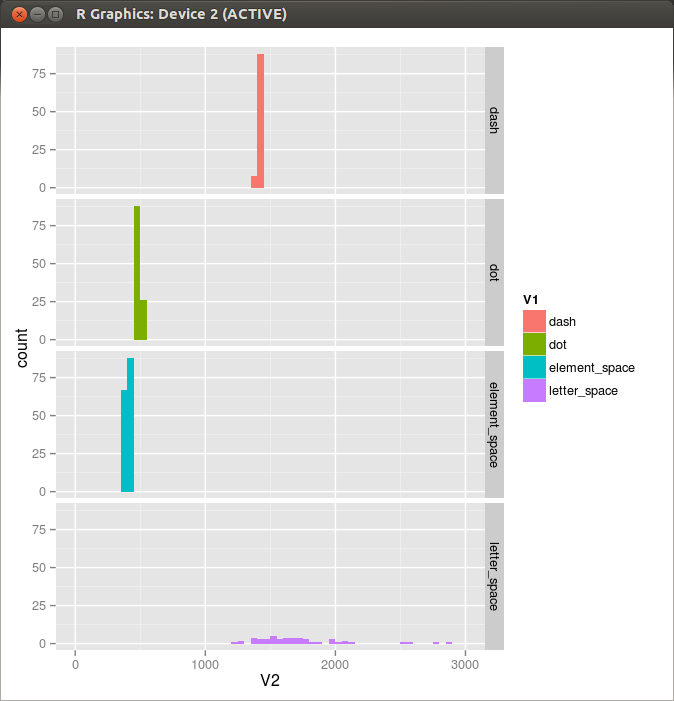 Figure 3. Histogram 3
Yet another from JO1FYC.
[4] http://homepage2.nifty.com/jo1fyc/sound/20010504nikki02.MP3
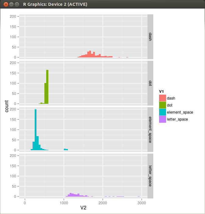 Figure 4. Histogram 4
Still another from JO1FYC.
[5] http://homepage2.nifty.com/jo1fyc/sound/20010504nikki03.MP3
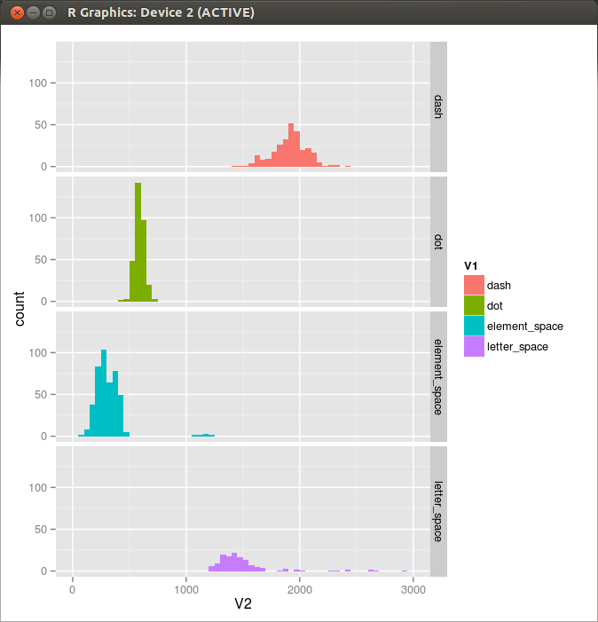 Figure 5. Histogram 5
Data sets in R are most often stored in data frames. A data frame is a two dimensional data structure, with each row representing a case and each column reresenting a variable. You can generate a data frame, for example, from vectors as in the following way, where each vector represents a column.
> name    <- c("Alpha", "Bravo", "Charlie", "Delta")
> weight  <- c(31.0, 47.2, 69.5, 99.8)
> price   <- c(9.2, 13.7, 21.4, 38.5)
> example <- data.frame(name, weight, price)
> example
     name weight price
1   Alpha   31.0   9.2
2   Bravo   47.2  13.7
3 Charlie   69.5  21.4
4   Delta   99.8  38.5
Once you have a data frame, it is a relatively simple task to analyze the data and to draw graphs of various types.
> graph <- ggplot(example, aes(x=weight, y=price))
> graph + geom_point() + stat_smooth(method=lm)
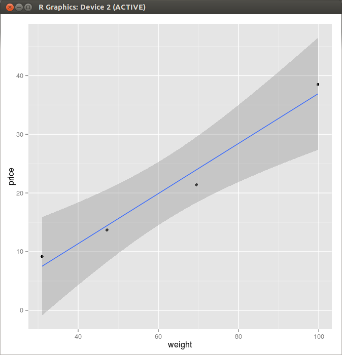 Figure 1. Scatter Plot and a Linear Regression Line
        letter_space      11688          0
                 dot        510          0
       element_space        265          0
                 dot        533          1
       element_space        341          0
                 dot        511          2
       element_space        333          0
                 dot        499          3
        letter_space       1451          0
                 dot        541          0
       element_space        530          0
                dash       1647          0
       element_space        281          0
                 dot        505          1
        letter_space       2539          0
           (853 more lines deleted..)
Here is a first part of the output from “myprog” which reads a file containing Morse code that starts with “HR HR” by JO1FYC.
[1] http://homepage2.nifty.com/jo1fyc/sound/20051010_nikki-32.mp3
This is a text file and readily loaded into R by using read.table().
> mydata <-read.table("20051010_nikki-32_8kHz.aaa", header=FALSE)
> ggplot(mydata, aes(x=V1, fill=V1)) + geom_histogram()
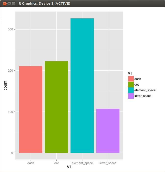 Figure 2. Histogram
It seems that the duration of dot cycle is almost constant except for the last few seconds. So I extracted a “nice part” of the dot and space duration data from the originals by discarding the first ten and the last sixty-two points, and tried to find the line of best fit by applying a linear model.
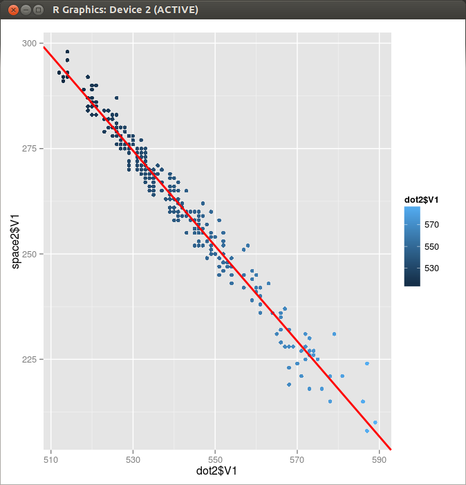
Figure 1. Dot and Space pair in a Single Dot Cycle
> dot2   <- read.table("BK2.dot"  ,header=FALSE)
> space2 <- read.table("BK2.space",header=FALSE)
> res=lm(space2$V1~dot2$V1)
> res

Call:
lm(formula = space2$V1 ~ dot2$V1)

Coefficients:
(Intercept)      dot2$V1
     873.38        -1.13

> p <- qplot(dot2$V1,space2$V1,color=dot2$V1)+geom_point(shape=23,size=1)
> p+ geom_abline(intercept=873.38, slope=-1.13, colour="red", size=1)
Draw the same graphs with the library ggplot2.
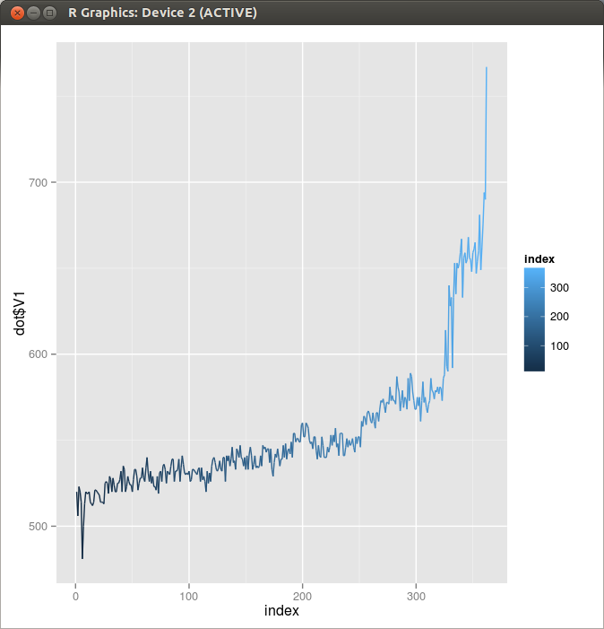 Figure 1. Dot Length
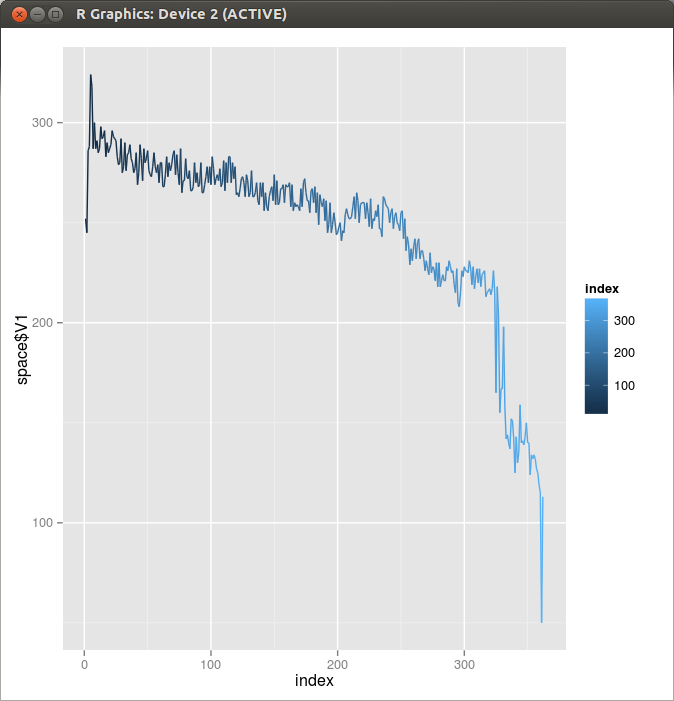 Figure 2. Space Length
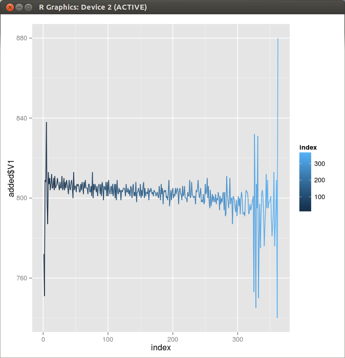 Figure 3. Duration of Dot Cycle