Very interesting..
You see that she possesses a tremendous amount of expressive ability by means of playing the piano during the talk.
It is something like you have a megawatt linear amplifier, isn’t it?

Ham Radio Blog
Very interesting..
You see that she possesses a tremendous amount of expressive ability by means of playing the piano during the talk.
It is something like you have a megawatt linear amplifier, isn’t it?
Now, it became a one column layout again. I should have written my own style.css including media queries, for example:
@media screen and (min-width: 1000px) {
    .has-sidebar:not(.error404) #primary {
        float: right;
        width: 58%;
    }

    .has-sidebar #secondary {
        float: left;
        padding-top: 0;
        width: 36%;
    }
}
With the above code, the sidebar should appear on the left side only if the screen width is more that 1000px.
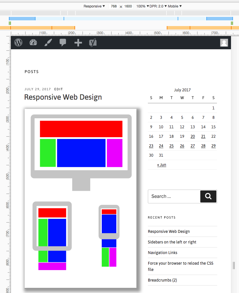
This is when the width is 768px.
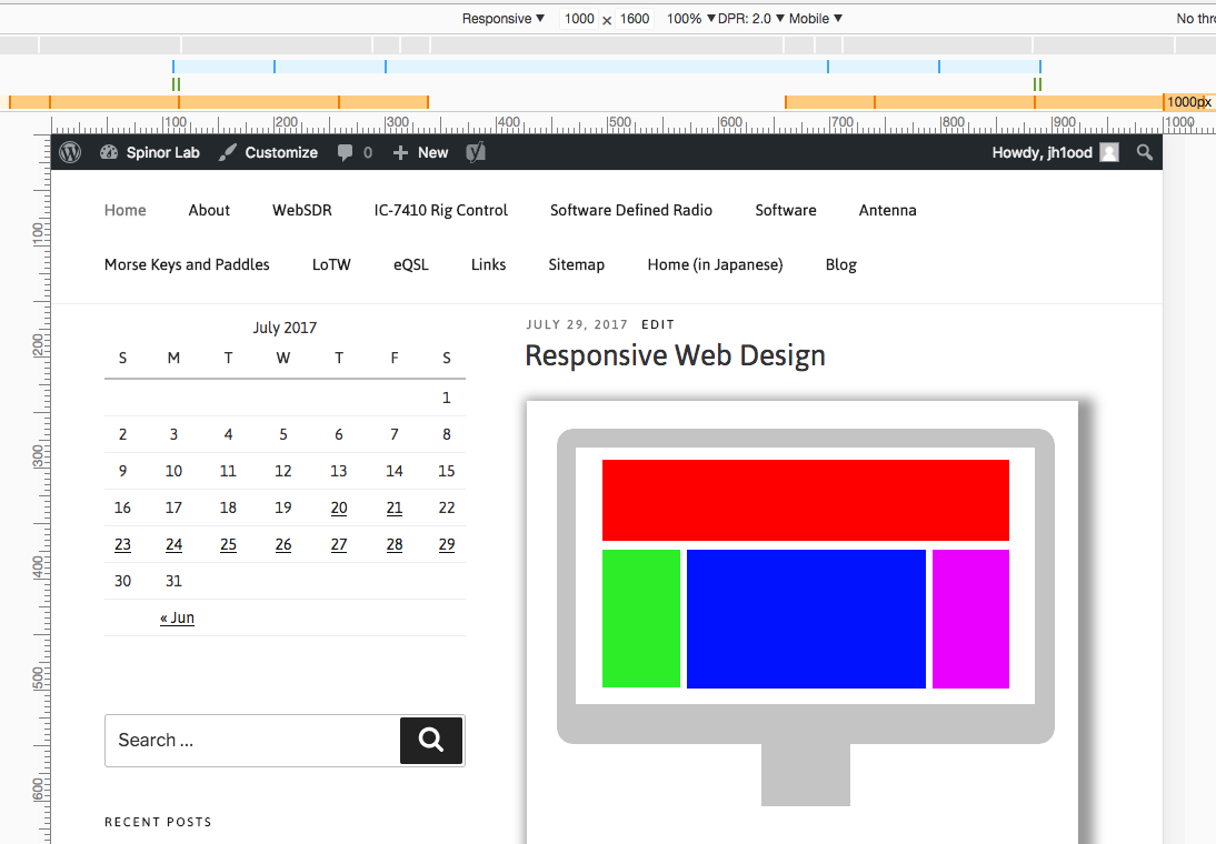
And this, with 1000px.
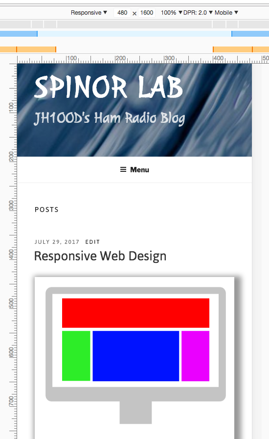
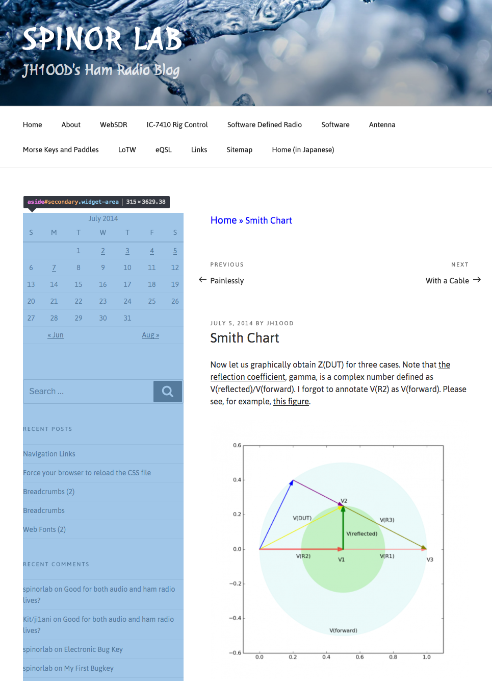
Twenty Seventeen is a theme for WordPress and is “responsive”, providing you with the one column layout when your device’s screen width is too narrow to accommodate two colums.

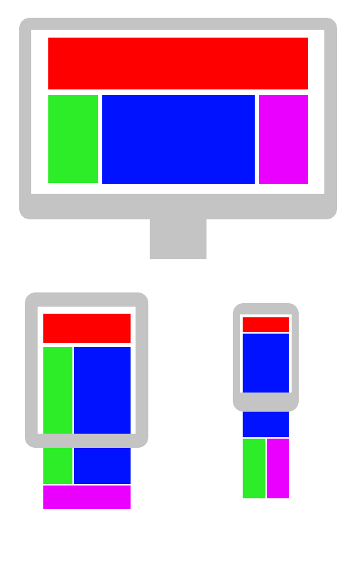
The figure above is with Twenty Seventeen in its original form. See that there is only one column. (The bottom half of the screen is just one image, as you will see in the next figure.)
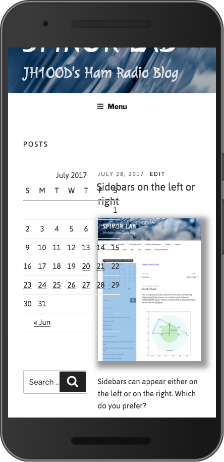
This is after I did some modifications to the theme. See that the image is displayed with shadow, and the sidebar is on the left rather than on the right. Bt, wait! Why do we have two columns!? Something must be wrong with Media Queries, I suppose.
@media screen and (min-width: 20em)
@media screen and (min-width: 30em)
@media screen and (min-width: 48em)
@media screen and (min-width: 67em)
@media screen and (min-width: 79em)
@media screen and ( max-width: 48.875em ) and ( min-width: 48em )
Sidebars can appear either on the left or on the right. Which do you prefer?
.has-sidebar:not(.error404) #primary {
    float: right;
    width: 58%;
}

.has-sidebar #secondary {
    float: left;
    padding-top: 0;
    width: 36%;
}
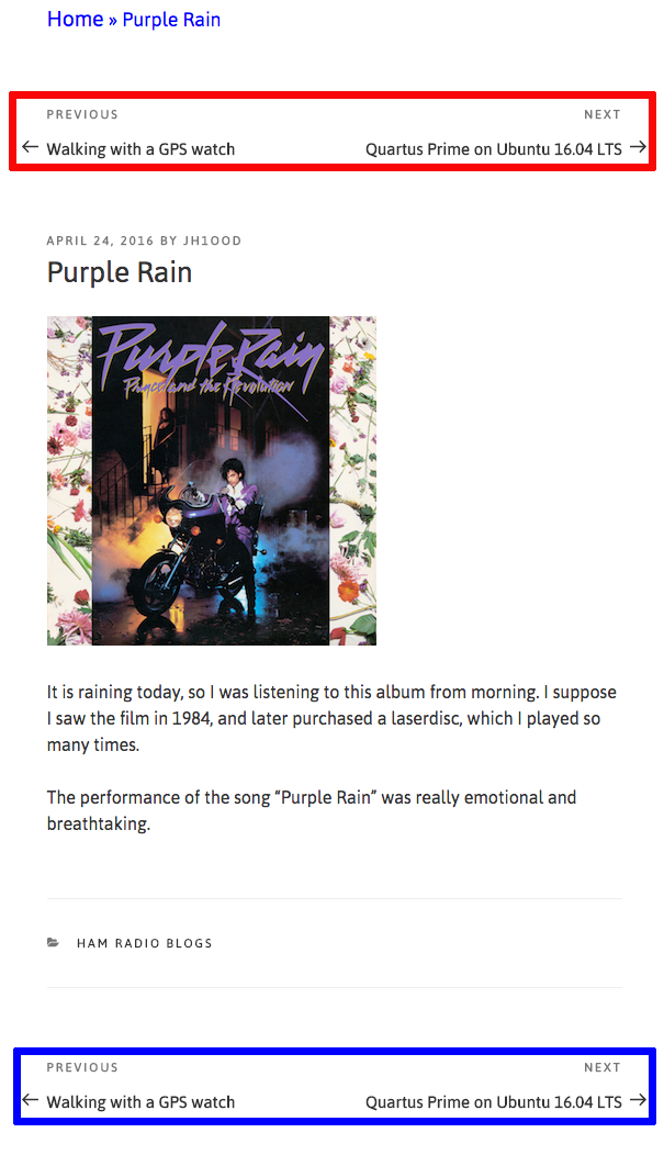
Navigation links to the next and previous pages are often found at the bottom of the page (see the blue box), but I do not like it, because you need to scroll all the way down even if you are not interested in the article.
I much prefer the links being at the top of the page (see the red box). You can just keep clicking without moving your mouse until you find the one which seems interesting.
In many cases, just refreshing the page is not enough to load the latest version of the CSS files, thus failing to show you the pages with the latest (and intended) style.
There are various ways depending on your OS and browsers to do a cache refresh. One example is:
But, it seems that we do not have a simple procedure if you are using iOS or Android.
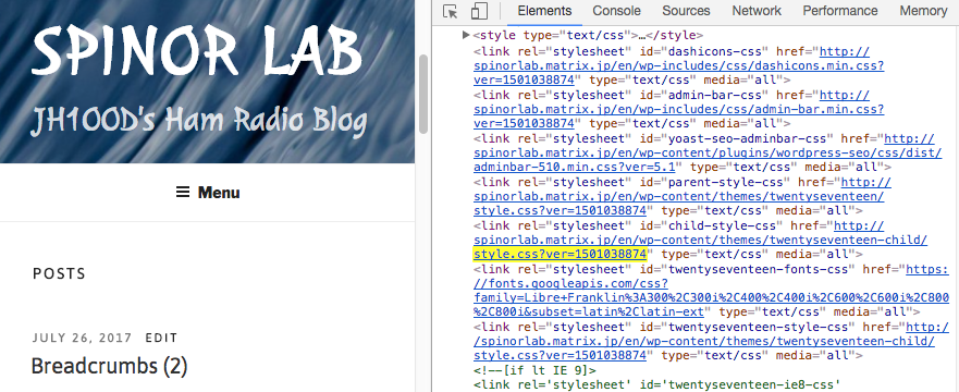
One method, which I use here, is to give a new version number to the CSS files each time they are rewritten. In the figure, the file modification time, represented in UNIX time, is used as a version number. The line highlighted in yellow reads:
<link rel="stylesheet" id="child-style-css" href="https://spinorlab.matrix.jp/en/wp-content/themes/twentyseventeen-child/style.css?ver=1501038874" type="text/css" media="all">
A short PHP program hooked to your WordPress will take care of the things automatically.
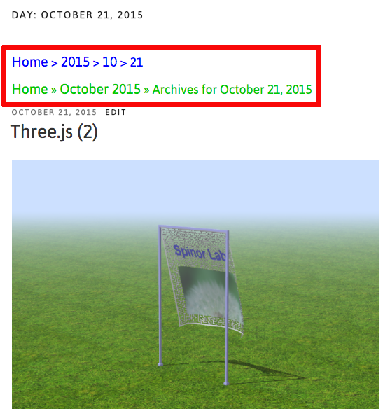
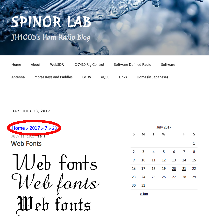
The second breadcrumb trail line in the red box is generated by Yoast SEO. Which one looks nicer?
A breadcrum trail is a navigation tool to show the position of the current page in the site hierachy.
If you are using WordPress, many plugins are available to add breadcrumbs to your site, but now I am trying to write PHP codes myself.
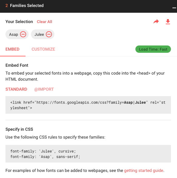
Now, using two Google Web Fonts families, Asap and Julee.

Using Web fonts is an effective way to show the visitors of your site what you really wanted to present regardless of the availability of the fonts in each user’s environment.
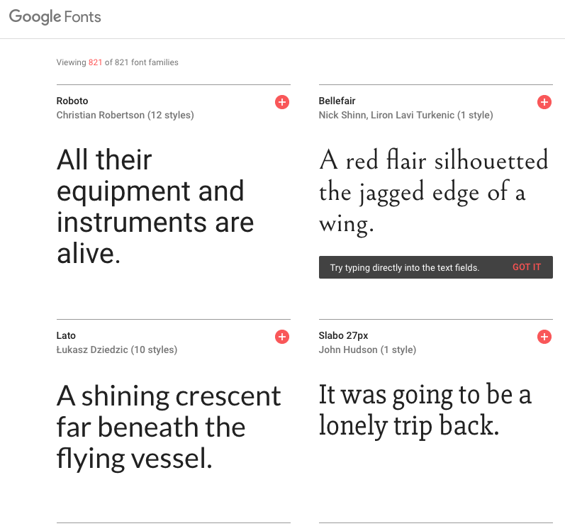
There are more than 800 fonts available with Google Fonts, and they may help enhance the look of your site if properly used.
Unfortunately, if you are dealing with some exotic characters, like Chinese characters, the situation becomes rather complicated because of the large number of the elements in the set.
I might consider using Google Noto Fonts, but this time I am trying some families of Morisawa Web fonts.
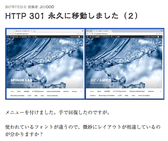
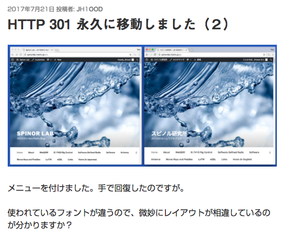
Do you see the differences?