
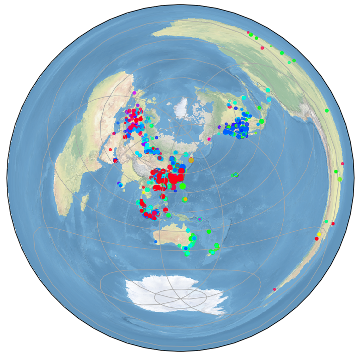
This may look better if you live in Japan.
cent_lon = 152.5
ax = fig.add_subplot(1, 1, 1, projection=ccrs.PlateCarree(central_longitude=cent_lon))
x.append(mylon-cent_lon)
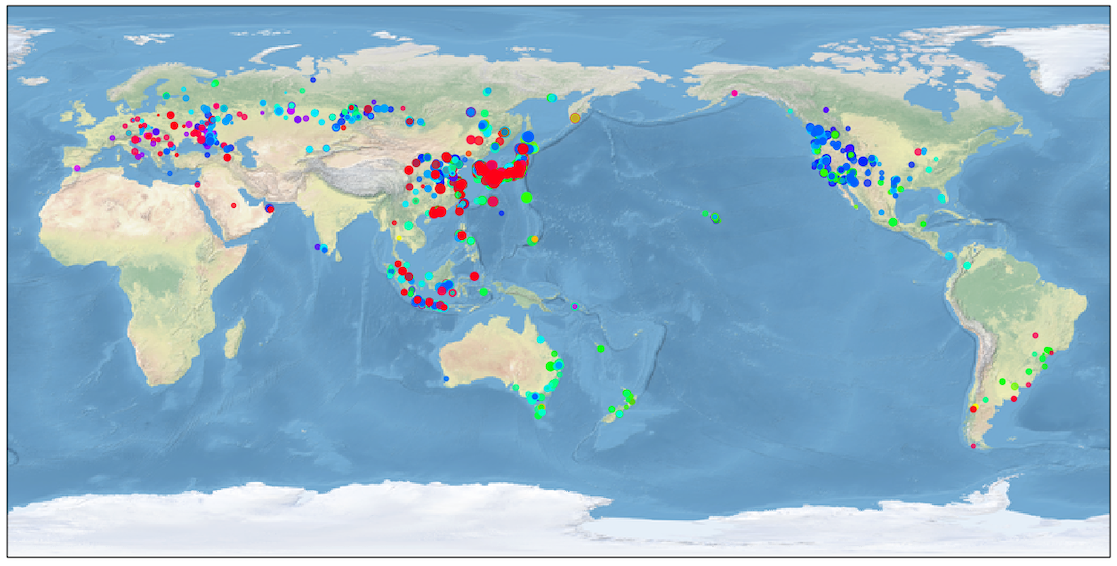
The color shows the time of the day, and the dot size SNR.
![]()
The colormap “hsv” is used. The leftmost part if for 00Z, and the rightmost for 23Z.
cent_lon = 139.7
cent_lat = 35.7
ax = fig.add_subplot(1, 1, 1, projection=ccrs.AzimuthalEquidistant(central_longitude=cent_lon, central_latitude=cent_lat))
x.append(mylon)
ax.scatter(x, y, c=c, s=r, cmap='hsv', alpha=0.7, transform=ccrs.Geodetic())
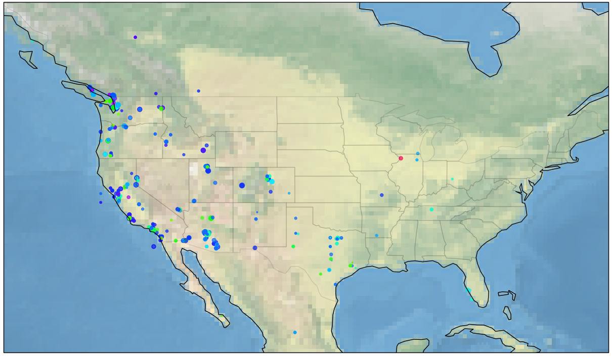
ax.set_extent([-135, -66.5, 20, 55], ccrs.Geodetic())
shapename = 'admin_1_states_provinces_lakes_shp'
states_shp = shpreader.natural_earth(resolution='110m', category='cultural', name=shapename)

for state in shpreader.Reader(states_shp).geometries():
    facecolor = [0.9375, 0.9375, 0.859375]
    edgecolor = 'black'
    ax.add_geometries([state], ccrs.PlateCarree(),      facecolor=facecolor, edgecolor=edgecolor, alpha=0.1)