
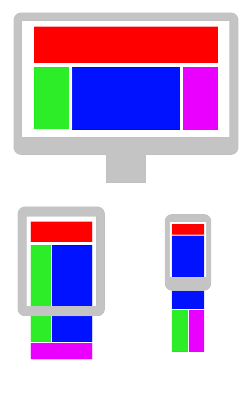
Twenty Seventeen is a theme for WordPress and is “responsive”, providing you with the one column layout when your device’s screen width is too narrow to accommodate two colums.
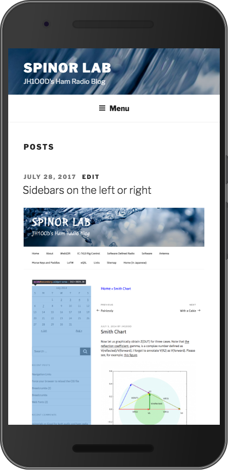
The figure above is with Twenty Seventeen in its original form. See that there is only one column. (The bottom half of the screen is just one image, as you will see in the next figure.)
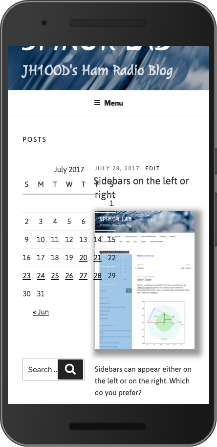
This is after I did some modifications to the theme. See that the image is displayed with shadow, and the sidebar is on the left rather than on the right. Bt, wait! Why do we have two columns!? Something must be wrong with Media Queries, I suppose.
@media screen and (min-width: 20em)
@media screen and (min-width: 30em)
@media screen and (min-width: 48em)
@media screen and (min-width: 67em)
@media screen and (min-width: 79em)
@media screen and ( max-width: 48.875em ) and ( min-width: 48em )