
もし、あなたが日本に住んでいるのならこの方が見やすいかもしれません。
cent_lon = 152.5
ax = fig.add_subplot(1, 1, 1, projection=ccrs.PlateCarree(central_longitude=cent_lon))
x.append(mylon-cent_lon)
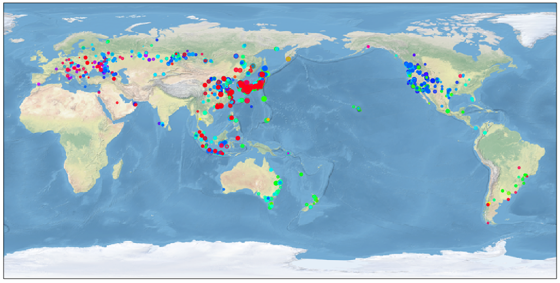
色は1日の中の時間を表しています。点の大きさはSNRです。
![]()
カラーマップは、”hsv”です。左端が00Zに、右端が23Zに対応しています。
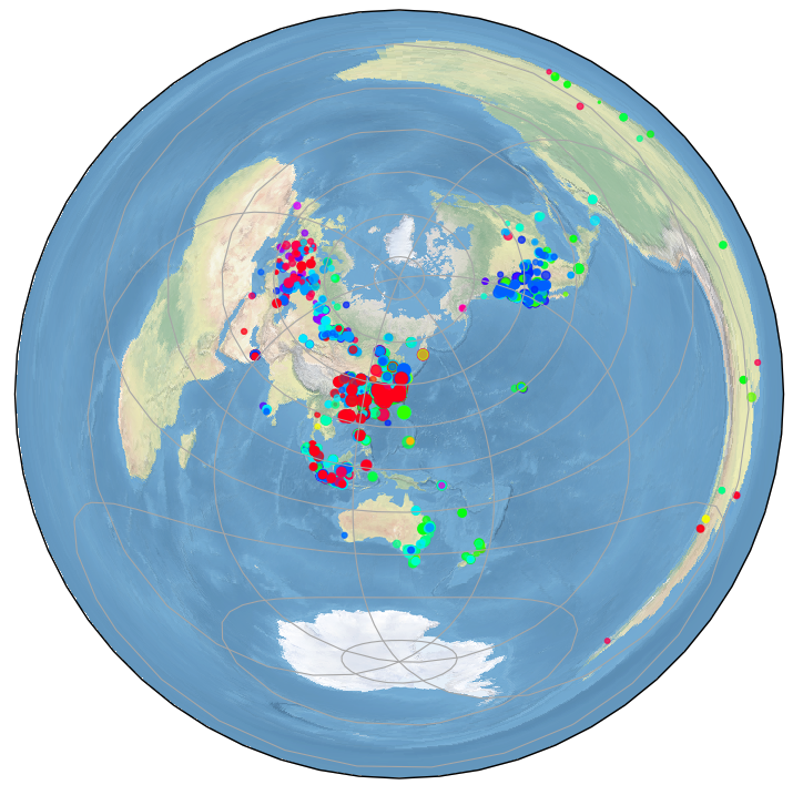
cent_lon = 139.7
cent_lat = 35.7
ax = fig.add_subplot(1, 1, 1, projection=ccrs.AzimuthalEquidistant(central_longitude=cent_lon, central_latitude=cent_lat))
x.append(mylon)
ax.scatter(x, y, c=c, s=r, cmap='hsv', alpha=0.7, transform=ccrs.Geodetic())
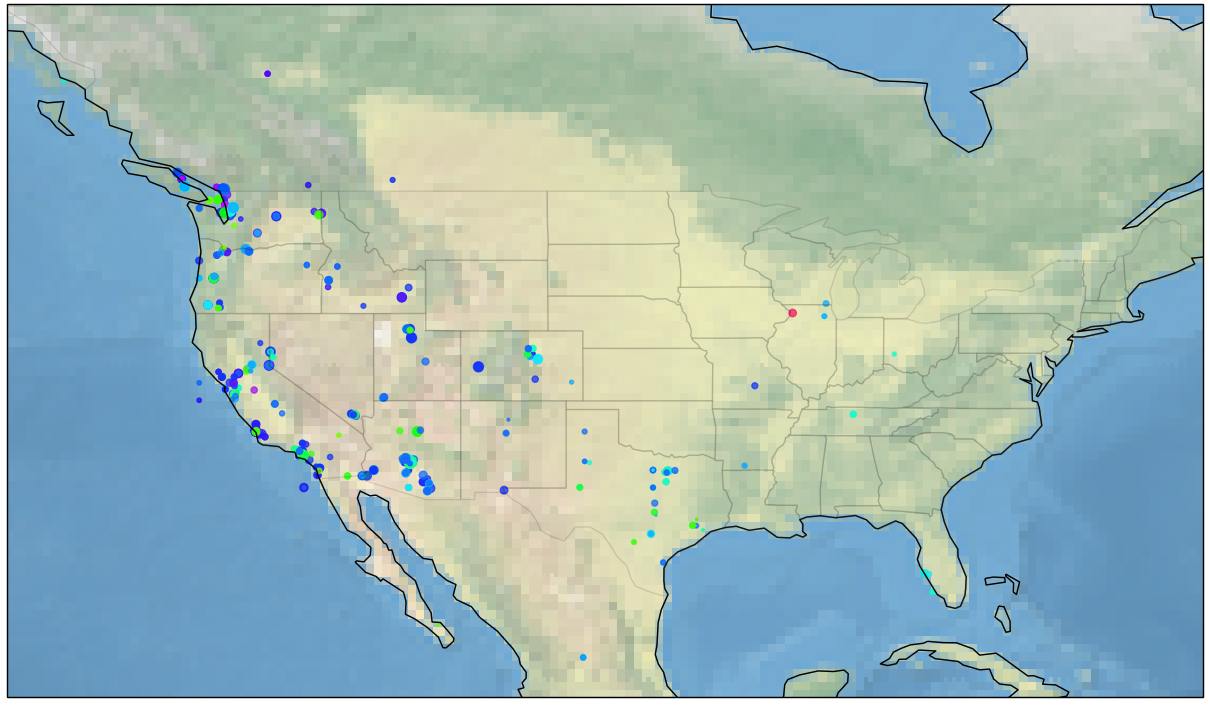
ax.set_extent([-135, -66.5, 20, 55], ccrs.Geodetic())
shapename = 'admin_1_states_provinces_lakes_shp'
states_shp = shpreader.natural_earth(resolution='110m', category='cultural', name=shapename)

for state in shpreader.Reader(states_shp).geometries():
    facecolor = [0.9375, 0.9375, 0.859375]
    edgecolor = 'black'
    ax.add_geometries([state], ccrs.PlateCarree(),      facecolor=facecolor, edgecolor=edgecolor, alpha=0.1)